
Varied and Creative Wine Label Designs
Forbes magazine recently selected a list of their favorite wine labels. Read the full article and see all the labels by clicking here. Rose City Label didn’t print any of these, but they are good examples of beautiful, simple design. We hope they will give some inspiration to our designers and customers and help us keep a pulse on the ever changing wine label market. We have previously written about authentic design in this post – please read it again to get a general overview of label design basics.
Clare’s Tips – Be Authentic
Clare Carver also placed great emphasis on authenticity during her talk at the wine symposium this year in Portland. Read about her tips by clicking here. In her second of five tips, she says to ‘be yourself and make authentic connections with customers’. This is critical if we want our story to be true and lasting – it must be authentic and not waver over time.
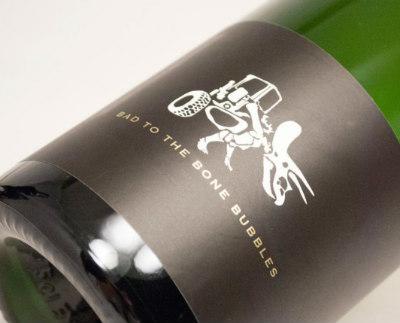
Black is Back and it is Clean
This label is particularly attractive for what it does not have. It isn’t crowded or overly stylized. The ‘white space’ (which happens to be black on this label) makes the few design elements really stand out. The simple logo and bold type stand out and make a statement. They aren’t fighting with other elements for attention. This is clean, simple and effective.
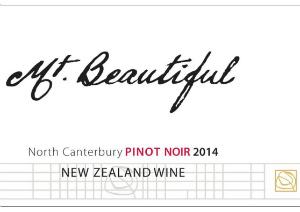
Mt. Beautiful Is (Beautiful)
This label shows off crisp type on a bright white background. The other great design feature is a combination of formal (square/rigid) elements in the type and grid at the bottom with the bold script type in the headline. It is never good to mix too many typefaces on one design, but this stark contrast makes each element stand out. Finally, the very little splash of color in the type (Pinot Noir) and the small gold logo element at the bottom right also stand out. They aren’t screaming for attention, but they are a subtle touch to give a little ‘pop’ to an otherwise stark design.
 Spaghetti Already
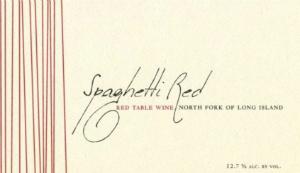
Unlike the other two examples, this is more of a traditional, warm design. The cream, eggshell paper gives a warm feeling like a spaghetti dinner. The vertical lines look a bit like spaghetti noodles – they are not perfectly parallel so they soften the effect a bit, but still give the design some whimsical feel. Finally, the hand-written script on the title reinforce the approachable, family feeling to this label. It seems like a low-key, informal wine you would enjoy with family or close friends on a weeknight.
We Have People for This!
We don’t do much creative design at Rose City Label. Rather, we partner with an excellent group of smart, creative, independent people that can really bring your brand to life. As our wine label production as grown, we have been in closer contact with these professionals and we would be happy to refer you to an appropriate designer. If you are just starting out, or if your brand needs a refresh, please contact us. We can help.