by Scott Pillsbury | Nov 17, 2022 | Company News, Label News
The current market conditions have caused a flurry of price increases across the printing industry. Here are just a handful of statements from our vendors in recent months:
“The price increase is due to several market conditions outside of our control. These conditions include escalating commodity pricing of raw materials, increasing freight costs, as well as the continued effects of nationwide inflation and labor shortages.”
“These adjustments are necessary to offset continuing increases in the cost of paper.”
“Inflation has accelerated in the wake of recent mill closure announcements.”
“To ensure the continuity of supply, we will adjust prices for any shipments.”
“Paper mills capacity reductions (mill closures) and diversion of mill capacity to non-PSL markets have created an extremely tight domestic supply situation for paper face and liner materials critical to our industry.”
“Extremely high raw material and indirect costs are causing continued inflation, especially on paper products.”
These are just a few lines from six letters we received from various suppliers across the paper industry. The message is coming through loud and clear: global inflationary pressure, demand for paper, and shortages due to mill closures are causing industry-wide price increases.
Even though we’re following suit with price increases, Rose City Label is in a fortunate position for the following reasons:
- We have a high inventory of various label materials, giving us tons of flexibility with producing labels for our clients.
- We have strong relationships with our vendors that go back decades. Even with the volatility in the paper industry, we feel great about having the ability to acquire paper materials needed to serve our clients.
- We have the capability for high-capacity label printing thanks to our new press, meaning that we can produce the jobs for you faster and in higher quantities than ever before!
As always, we appreciate your understanding during these challenging times. We remain committed to serving you whether you need wine, beer, or specialized product labels!
Ready for us to tackle your next label job? Get a quote here

by Scott Pillsbury | Nov 20, 2018 | Company News, Label News, Technical
State of the Art Label Printing – HP 6900 Press
This machine is a massive upgrade to our digital department. We will be able to help more people with more high-quality digital labels than ever. This machine provides the most sustainable digital label platform. Here are a few of the highlights.
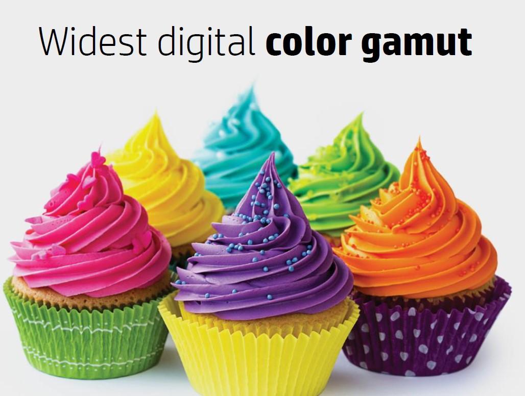
Better Image Quality
Because of the improved laser writing head, the image resolution is better than ever. This means brighter, more vibrant colors, crisp text, and even more precise color matching. State of the Art Label Printing – HP 6900 Press
Double Print Speed
At nearly 100 feet per minute, this press rivals traditional print speed. No setup and virtually no waste mean faster delivery for customers.
More Efficient Press Layout
Besides the faster speed, the press is more efficient. This is a web press with labels delivered in rolls, but the images are transferred to the material in pages (called ‘frames’ in HP lingo). This press has more than double the page size of the previous machine. Maximum label size is now 12″x 38″. More importantly, we can fit more labels of any size into this frame size which means less waste, faster printing, and better results for customers.
 Better Color Consistency
Rather than just measuring ink density during the run, this press actually sees color and corrects itself on the fly! With ‘Continuous Color Calibration’ the machine constantly makes micro adjustments during the print run to keep the tightest color in the industry. This also improves run to run color consistency. Repeat orders with exact color matching are easier than ever.
Sustainable Platform
The inks on the press are formed by a mixture of pigment (the consistency of toothpaste) and imaging oil to carry the color. Previously, this imaging oil was flushed from the press and discarded. Now, the press recycles its own oil! Rather than doing an ‘oil change’ periodically, only a small amount of oil is added to the system as needed.
Fluorescent and Metallic Silver Ink
For the first time, true specialty inks are available on a digital press. This adds to our very wide 7C color gamut to add distinctive color to your label.
More Powerful Variable Data
Want a unique number, barcode, or QR code on each label? We can do that faster and more accurately than ever. With a huge computing power upgrade, variable data jobs that previously took hours (and cost more) are now instantaneous.
Supportable for the Future
Built on the latest technology, this press will be supported for many years. With parts, service, and training readily available, you have a reliable, consistent source for all your labels.

by Scott Pillsbury | Nov 20, 2018 | Beer Wine Spirits, Company News, Environmental Green, Label News
Rose City Label Recognized with TLMI Environmental Leadership Award for 2018
Rose City Label won the Environmental Leadership Award at the 2018 Annual Meeting of the top label printers in America. This Environmental Leadership Award is given annually to one printer and one supplier based on judging  the association environmental community. The award recognizes specific programs, demonstrated results, and a cultural commitment to the environment. We are very honored to join the list of past winners and we will never stop on our eco-friendly journey. This year, the awards were renamed in honor of Calvin Frost – a true environmental leader in the printing industry. There is nothing better than a cold frosty beer from our customer in the commemorative ‘Frosty 2018’ mug.
Results Matter
Trying hard and having commitment are important, but for the TLMI Environmental Leadership Award, results matter:
- Five Year Water Reduction of 47%
- Five Year Natural Gas Reduction of 43%
- Small reductions in Garbage and Electricity as well
All measures are indexed to manufacturing output as our business has grown considerably in the past 5 years. Complete details and annual graphs of these measures can be found in this blog post.
Small Things that Every Business Can Apply
Besides these dramatic results, the committee was impressed with the programs and projects the company has championed. These include:
- Encouraging employee bicycle commuting
- Providing excess pallets for employee home garden projects
- Recycling pallet wrap at the local supermarket
- Giving away excess pallets on Craigslist for local projects
- Shipping via direct courier service whenever possible
- Reusing items in the press room during production runs
More about these innovative programs can be found at these two blog posts click here for part 1 and click here for part 2.
Make Conscious Choices
The final area called out by the judges in this award was a leadership commitment to the environment. This philosophy is baked into the business so deeply that an employee recently lobbied for an electric car charging station – she knew it would align with our values (and with her new car), but also would provide marketing value and would contribute to this award criteria. All team members know we are focused on the environment. Some additional major indicators:
- Conversion to 100% wind power – read more here
- Water wash printing plates – among the first on the West Coast to adopt this system – read more here
- Monthly review of eco-metrics along with financial performance
Honoring the Label Eco-Legend – Calvin Frost
 This award was particularly important to us since it was renamed in honor of our longtime friend and vendor, Calvin Frost. Calvin has been the voice of the sustainability movement for decades and his message is finally being heard far and wide in the industry. Calvin’s company, Channelled Resources, is basically one big recycling business. For over 40 years, the company has inspected and salvaged potentially damaged product. This stock would be destined for the landfill if his company didn’t take the time to sort and save the (large percentage) of this material.
Winning this award any year would be great, but to the first ever ‘Frosty’ award winner is even better!
Thank You – Call Us Today
We are ready to help others become more ‘green’. Any success we have is a team effort and we want to help you on your journey. Are you just getting started? Or need some pro-level tips? Please call us today. If you buy labels, that is fantastic, but we will help any business with a true desire to learn and grow in their eco-journey. Cheers!

by Scott Pillsbury | Sep 23, 2018 | Company News, Environmental Green
We are very proud of the good work we do to be an eco-friendly company. Our people care about the earth we share and they are proud to be a part of a company that considers the environment. Not all projects we start end up with dramatic results, but our eco-efforts certainly do. Over time, as we have measured and worked, the gains have piled up in all areas. Please contact us if you have questions.
Results – The Numbers Don’t Lie!
Once we were committed to the green business, we knew we needed to measure our results. Each month we measure these four eco-measures. These are indexed to our production – resources consumed per unit of production. Over the past five years, our business has grown considerably, so our absolute consumption has increased, but on a per unit of production basis, we have made fantastic gains. Check out these graphs!
Electricity – Down 3% since 2013

Water – Down 47% since 2013

Garbage – Down 7% since 2013

Natural Gas – Down 43% since 2013

Thank You! We appreciate all your support
We do this all for you, our amazing customers. Thank you for pushing us to do better every single day. We aren’t done yet – we will continue to work hard to make our company more and more eco friendly into the future. Are you on the same journey? Anything we can do to help? Please call us today, we would love to share more about our programs and the results we have achieved.

by Scott Pillsbury | Sep 5, 2018 | Customers/Examples, Technical
Keeping Consumers Safe with a Prop 65 Label
There is a huge new burden on manufacturers that sell products to consumers in California – and it may require a label update:
All manufacturers, producers, packagers, importers, suppliers, and distributors, regardless of whether they are located in California or out of state, must provide a warning if their products cause exposures to any listed chemical to individuals in California.
If you are selling anything with ingredients on the prohibited list, you may need to update the language on your labels. The NFIB has an excellent summary of the newly updated law on their website. According to NFIB,
More specifically, a warning label is required if the chemical included has either a 1 in 100,000 chance of causing cancer over a 70 year period, or unless it may be said that exposure to 1000 times the amount of the chemical within the product has no observable effect on reproductive health
The update effective in August 2018 is actually just a more strict interpretation of the law passed in 1986 – Safe Drinking Water and Toxic Enforcement Act This law requires disclosures if any of 900 listed chemicals are present in your product. Read the full NFIB article by clicking here.
California even has a specific website dedicated to the new law. Check more on that site by clicking www.p65warnings.ca.gov
We are All About Full Disclosure
This law seems onerous, but it is no more so than the mandate 20+ years ago to provide nutrition facts on all food packaging. Now, this consumer information seems standard, but at one time, it was a big change for all food producers. This will be the same. Besides marketing and branding, your labels need to give consumers clear and complete information.
Easy Redesign
We aren’t a graphic design company, but we can help with basic layout changes. Editing your label to be compliant and still be attractive – we can do that. We are experts at fitting lots of information onto a small label. The cost for this redesign is very affordable in most cases. And, if you need a full rebranding, we can refer you to some excellent design agencies. Adding a separate Prop 65 label to your packaging is another option – we can help with that too.
Other Label Questions? We can help
As always, we are here to help with any and all label questions. We can help with technical, aesthetic and financial questions related to your label project. Please call us today. We would be happy to help.
This article is intended to provide Oregon and Washington businesses with general information and is not intended to serve as legal advice regarding any specific matter; information should not be acted upon without legal advice.