
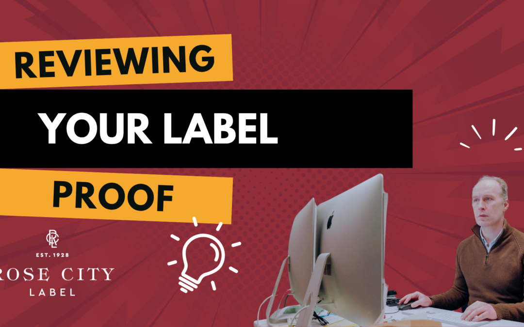
Reviewing Your Label Proof: Two Things to Check Before You Sign Off
Signing off on a label proof feels routine, until something goes wrong on press and you're staring at a stack of finished labels with a missing vintage year, a misaligned graphic, or a color that doesn't match what you saw on screen. Most of those surprises trace back...

A Major Upgrade to Our Digital Press, and What It Means for Your Labels
At Rose City Label, color consistency is one of the most challenging aspects we strive to achieve, and one of the most crucial. If your brand relies on a specific color to stand out on the shelf, you already know how much it matters. This month, we’re adding HP...

Let’s Go Flexo! – Part 4: Working with Images that Have Transparent Backgrounds
In flexographic printing, we love creative label designs that layer images and color, but things get tricky when transparent images are placed over backgrounds. Transparent images won’t trap to other elements in your design. If you're a designer, you don't need to...

Your Food Label is Gorgeous. But is it Legal?
You've done it. You've perfected your grandma's secret sauce, found the perfect sustainable packaging, and are ready to share your creation with the world. The last step is the label—the beautiful, eye-catching design that will make customers grab your product off the...

What is Bleed in Printing (and How to Create It Correctly)
If you've ever sent artwork to print, you've probably heard the term bleed. It's one of those critical prepress details that ensures your labels look clean and professional once they're cut to size. But what exactly is bleed, and how do you properly set it up? Let's...