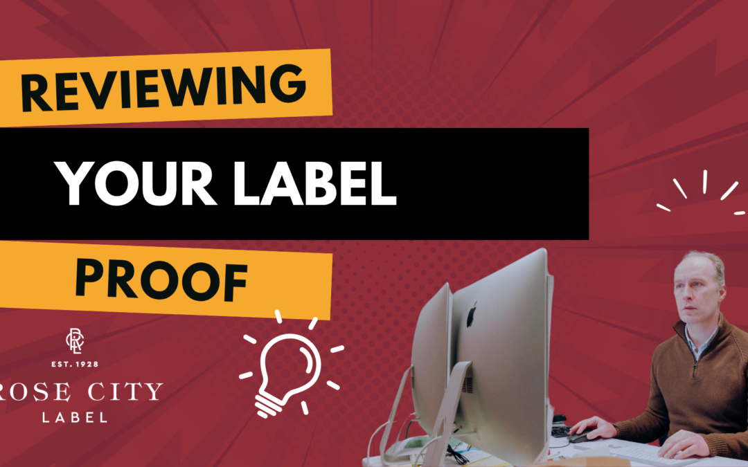
Signing off on a label proof feels routine, until something goes wrong on press and you’re staring at a stack of finished labels with a missing vintage year, a misaligned graphic, or a color that doesn’t match what you saw on screen.
Most of those surprises trace back to two specific factors that are easy to miss when reviewing a PDF proof: how the proof appears on your screen and how it prints on your office printer. Both are controlled on your end, in your PDF viewer, and both can quietly mislead you if you don’t know what to look for.
The short tutorial below walks through exactly what to do.
If you’d rather read than watch, here’s the quick version.
1. Print your proof at actual size
When we send you a proof, it’s a PDF set to the exact dimensions of your finished label. That matters because if the label is small enough to fit on standard paper, you can print it, cut it out, and physically place it on your bottle or jar to confirm it looks right and actually fits.
The catch: most PDF viewers default to shrinking the proof down to fit on letter-size paper. That defeats the entire point. A label that “looks good” at 87% will not look the same at 100%.
In your print dialog, look for a scaling setting. Depending on your PDF viewer, it might be labeled:
Actual size
100%
Do not scale
Scale to 100%
The exact wording varies. Adobe Acrobat and Adobe Acrobat Reader use “Actual size”; other viewers phrase it differently. But they all mean the same thing: print the file at the dimensions it was created at, with no resizing.
To make verification easy, every proof we send includes a small ruler marked at 3.5 inches. After you print, hold a real ruler up against ours. If the two match, you’ve printed at actual size. If they don’t, your printer scaled the file down. Adjust your print settings and try again.
2. Turn on Overprint Preview
This one is more technical, but it’s the difference between catching a problem on a proof and discovering it on a finished press run.
Overprint Preview is your PDF viewer’s way of showing you how a document will actually look when printed on a professional press, rather than how it appears on a screen or from an inkjet printer. When it’s off, you’re seeing a screen-friendly approximation. When it’s on, you’re seeing a much closer simulation of what the press will actually produce, including how overlapping inks will interact.
Here’s the problem: in Adobe Acrobat and Adobe Reader, Overprint Preview is off by default for most files. You have to turn it on yourself.
How to enable it in Adobe Acrobat or Adobe Reader
Open the Preferences menu (called Settings in some versions). Go to the Page Display pane. You’ll see an option for Use Overprint Preview, which by default is set to “Only for PDF/X files” — meaning it’s effectively off for the proofs you’re looking at. Change it to Always.
Why it matters: a real example
In the tutorial video above, you’ll see a proof for a wine label with the vintage “Syrah 2023” set in a very light yellow over a mustard-colored background. With Overprint Preview off, the year reads just fine. The proof looks correct, and you’d be tempted to sign off on it.
Turn Overprint Preview on, and the year disappears entirely.
What’s happening: the light yellow text was set to “overprint” the background. A screen or an inkjet printer mostly ignores that setting, so the text shows up. But a professional press honors that setting literally, and a very light color overprinting a darker color will be invisible. If you approved that proof without Overprint Preview enabled, you’d never know the vintage year was going to vanish until your labels arrived.
This is exactly the kind of issue our pre-press team works to catch and flag back to you before sign-off. But Overprint Preview gives you a second set of eyes on it, and lets you spot anything that should be discussed before the file goes to press.
A quick checklist for proof review
Before you sign off on any proof, run through this:
Printed at actual size (verified against the 3.5″ ruler on the proof).
Cut out and hold against the actual product or container where applicable.
Viewed on screen with Overprint Preview turned on.
All copy reads correctly — vintage years, ABV, net weight, ingredient lists, addresses, allergen statements.
Colors and finishes match expectations.
Any questions or flags we sent over have been addressed.
When something looks off, tell us.
If anything in your proof looks wrong, or if you turn on Overprint Preview and something disappears or shifts in a way you weren’t expecting, flag it back to us before you approve. That’s exactly what the proofing round is for, and we’d rather make the fix now than discover it after the press is running.
If you’re not sure how to enable Overprint Preview in your specific PDF viewer, or you want a second opinion on what you’re seeing, just reply to your proof email. We’re happy to walk through it with you.
At Rose City Label, we take pride in helping designers and brand owners create stunning, press-ready artwork. If you’re unsure how to prepare a file, our prepress team is here to help.
In flexographic printing, we love creative label designs that layer images and color, but things get tricky when transparent images are placed over backgrounds. Transparent images won’t trap to other elements in your design.
If you’re a designer, you don’t need to worry about trapping files yourself, but setting up your artwork correctly can make the process smoother and ensure your final label prints beautifully.
Here’s why transparent images can cause problems and how to fix them before your file reaches prepress.
Why Transparent Images Are a Problem
Trapping is the process of overlapping colors slightly so there are no white gaps if the stock shifts during printing.
When an image has a transparent background, our trapping software doesn’t have a defined color to work with. The program doesn’t know exactly where one color ends and the next begins.
So, even if your design looks perfect on screen, the software can’t calculate how to trap those edges. The result? Fine white lines, small gaps, or color mismatches around your image.
How to Fix It: Convert the Image for Trapping
To make a transparent image work in flexo printing, we must convert it to a solid image with a clipping mask and a filled background.
Here’s how that process works:
Step 1: Create a Clipping Mask in Photoshop
Open your image in Photoshop.
Create a new Alpha Channel and select the area you want to keep.
Delete that area from your alpha channel.
Invert the selection (Command/Ctrl + I) to define the background area.
Copy that mask (Command/Ctrl + A, then Copy).
Step 2: Paste into Illustrator and Trace
Paste the shape into Illustrator and size it to match your image.
Use Image Trace (set to Silhouette) to create a clean outline.
Expand the traced object, bring it to the front, and make it a Compound Path (Command/Ctrl + 8).
Select the image and path, then make a Clipping Mask (Command/Ctrl + 7).
Now you have a clean shape, but it’s still transparent.
Step 3: Add a Solid Background for Trapping
Go back to Photoshop and reselect the area around your image.
Contract the selection slightly (about 2 pixels depending on the resolution of your image).
Invert your selection to select the transparent area.
Use Content-Aware Fill to fill in that space.
This creates a subtle, color-matched fill behind your image.
Save and relink the updated file in Illustrator.
You’ll now have a filled image that looks the same visually, but under the hood, it has a solid background that the trapping program can recognize.
Why It Works
Adding this subtle fill gives the prepress software the correct information to overlap colors during trapping. The result is:
Clean edges
No white gaps
Smooth transitions between image and background color
Even though you can’t see the difference in your design file, this adjustment makes all the difference when your label runs on press.
The Takeaway
If you’re designing for flexographic printing, avoid sending files that rely on transparent backgrounds. Instead, use clipping masks and solid fills to ensure your artwork traps correctly.
These small steps help ensure your labels print beautifully without visible edges or color separation.
Watch the video below for a full demonstration of this process, including creating the clipping mask, filling the background, and setting up your file for trapping.
At Rose City Label, we take pride in helping designers and brand owners create stunning, press-ready artwork. If you’re unsure how to prepare a file, our prepress team is here to help.
If you’ve ever sent artwork to print, you’ve probably heard the term bleed.
It’s one of those critical prepress details that ensures your labels look clean and professional once they’re cut to size. But what exactly is bleed, and how do you properly set it up?
Let’s examine what bleed means, why it matters, and a few practical ways to incorporate it into your artwork.
Why Bleed Matters
Bleed is the area that extends beyond your label’s final cut line (die line).
There is always a small amount of movement as labels move through the press and cutting die. Without bleed, this can lead to thin white edges or bare stock showing where your design ends too close to the cut.
The rule of thumb:
Any artwork within 1/16 of an inch of the die line should continue at least 1/16 inch beyond it.
That extra buffer ensures a clean finish, even if the die shifts slightly during cutting.
Simple Bleed Example
For simple designs, bleed is straightforward. Imagine a solid gray background that runs to the edge of your label:
Just extend the shape 1/16 inch past the die line.
In Illustrator, you can use Offset Path to build that extra margin quickly.
That’s it, bleed done!
Trickier Bleed Scenarios
Sometimes bleed isn’t so simple. Here are three common cases and how to solve them:
1. Raster Images (Photoshop Files)
If your artwork ends right at the die line and you need more image beyond it:
Open the file in Photoshop.
Expand your canvas by 1/8 inch.
Use Content-Aware Fill to extend the artwork into the new space.
Save and re-import the updated image into your label design.
It may not be perfect, but it usually blends seamlessly once printed and cut.
2. Vector Artwork
Vector files are trickier. The best option is to make the art bigger.
But if the artwork must stop at the die line, you’ll need to extend elements manually:
Select and stretch vector shapes carefully.
Or redraw parts of the design to push them past the edge.
This can be tedious, but it’s the only way to ensure proper bleed when resizing isn’t an option.
3. Mixed Artwork
For labels that combine vector graphics and raster images, you may need to use both methods: content-aware fill for images, and manual adjustments for vector shapes.
The Bottom Line
Bleed may feel like extra work, but it’s one of the most critical steps in preparing artwork for print. It prevents bare edges, ensures consistent results, and gives your labels a professional finish.
Taking the time to add bleed upfront saves you (and your printer) headaches later.
Watch the video below for a complete walkthrough, including examples of extending bleed in Photoshop and Illustrator.
At Rose City Label, we’re here to ensure that your artwork is print-ready so that your labels look as good in real life as they do on screen. Contact us for a quote.
If you’ve ever heard a printer talk about “trap” or “trapping,” they’re not talking about catching anything. In the world of prepress, trap is a technique used to make sure your colors line up correctly on press, so you don’t end up with unwanted gaps or bare stock showing through your design.
Here’s a simple breakdown of what trapping is, why it’s important, and how you can catch mistakes before your label goes to print.
Why Do We Need Trap?
As labels move through a printing press, the stock can shift ever so slightly. If two colors are butted right up against each other, even the tiniest movement can cause them to separate, leaving a thin white line where the stock peeks through.
Trapping prevents this problem by making the colors overlap just a little. That way, even if there’s a bit of movement, your design still looks seamless.
How Trapping Works
Light Colors Next to Each Other For example, cyan next to yellow. In prepress, we’ll add a thin line of yellow that overlaps into the cyan. It’s nearly invisible, but it gives us a safety net.
Medium Colors When two medium colors overlap, you may notice the trap a little more; it can appear slightly darker. Still, it’s far better than seeing bare stock.
Dark Colors Darker combinations are the easiest. With black, traps are basically invisible, and sometimes we’ll even set black objects to overprint entirely, which makes them richer and darker.
Overprint Preview in Illustrator & Acrobat
One of the best ways to catch issues in your design is by using Overprint Preview in Illustrator.
Go to View > Overprint Preview.
Unlike regular Preview mode, this simulates how inks will actually interact on press.
It gives you a more accurate view of your colors and helps spot problems early.
When proofing you can do the same thing viewing your pdfs in Acrobat or Adobe Reader.
Go to Preferences or Settings > Page Display > Use Overprint Preview: Always.
If your customer has this setting set they can catch problems too.
For example:
Black type set to overprint looks great.
But if you accidentally set white text (0% CMYK) to overprint, it won’t print at all. In Overprint Preview, you’ll see it vanish—giving you the chance to fix it before sending files to your printer. Change your overprint setting in Illustrator in Window > Attributes
The Bottom Line
Trapping may not be glamorous, but it’s essential for high-quality printing. A little overlap between colors prevents white gaps, ensures cleaner results, and saves costly reprints.
And by working in Overprint Preview mode, you can spot potential mistakes early, keeping your design production-ready.
Watch the video below to see trapping in action, with real examples of how colors overlap on press.
At Rose City Label, we sweat the details so your labels look their very best. If you’re not sure about file setup or want us to double-check your artwork, we’re always happy to help.
In a previous video, we explained how to design for metallic stock. The shiny effect comes from printing directly on metallic paper, which uses white ink to block shine where you don’t want it.
Foil stamping works differently. Instead of using metallic paper, we stamp metallic foil onto the label.
This requires a slightly different setup.
Step 1: Create a Spot Color for Foil
Select the object you want foiled (for example, a blue logo).
Make a new spot color swatch and give it a clear name, like Blue Foil.
Apply this spot color to the object.
This tells the printer exactly where the foil should be applied.
Pro tip: Always name your spot colors clearly to avoid confusion during production.
Step 2: Embossing Setup
Embossing is created in a similar way to foil:
Copy the same object and paste it in place.
Move it to a new layer and create a new spot color named Emboss.
Set the object to overprint so you can see how it interacts with the foil in your file.
Now you can toggle layers on and off to preview foil and emboss separately. For even more accuracy, open the Separations Preview palette and toggle on and off there. This will make sure your overprints are correct.
Key Things to Remember
Foil is positive. What you see filled with the spot foil color is what will be foiled.
Embossing is also positive. The filled area is what will rise off the surface. You can specify it as a deboss instead if you want the filled area to be stamped lower than the surface.
Always use spot colors (not process CMYK) for foil and emboss.
Keep each effect on its own layer to stay organized.
The Payoff
By setting up your foil and embossing this way, you:
Ensure your file is production-ready
Avoid miscommunication with your printer
End up with labels that look polished, professional, and truly stand out
Watch the video below for a full step-by-step walkthrough in Illustrator.
Need help making your labels shine? The Rose City Label team is always here to answer questions and make sure your artwork is press-ready.
Getting your design press-ready for specialty label printing
At Rose City Label, we love helping our customers create bold, standout labels, and one of the best ways to do that is by printing on specialty stocks like metallic or clear. These substrates offer a premium look, but they also require a slightly different file setup to get great results.
In our latest video (see below), we walk through how to correctly set up your artwork for printing on metallic or clear stock. Below is a quick summary of the key steps and best practices we covered:
Why It Matters
Metallic and clear stocks allow the base material to show through your design, creating shimmer, shine, or transparency effects. But unlike standard paper labels, you’re not printing the metallic effect; you’re letting the stock do the work. That means you don’t design the metallic or clear effect directly—you plan around it.
Key Takeaways from the Video
1. Don’t Simulate the Effect with CMYK
If you want a part of your label to appear metallic, don’t use a faux gray or gradient to simulate the look. Instead, leave that part empty—set it to 0% CMYK. That’s how Illustrator (and your printer) knows you want the raw stock to shine through.
2. Create a Spot Color for White Ink
To control what parts of the design should not be metallic or clear, you need to print white ink underneath those areas.
Create a spot color and name it “White.”
Give it any visible color (blue, green, etc.) just so you can see it in your file—it doesn’t affect the print.
Make sure the white ink object is set to overprint.
Layer it on top of your other objects in your file—this makes it easier to visualize, even though it will print beneath everything else.
3. Use White to Block Out the Metallic or Clear
The white ink acts as a blocker. Wherever you place it, it prevents the metallic or clear stock from showing through, giving you a solid, opaque look.
Want only part of a design element to be metallic? Easy. Just:
Create a new shape on top of the white layer.
Fill it with 0% white (not empty—just 0% of the white ink spot color).
Set that to overprint as well.
This “knocks out” a portion of the white and lets the stock show through without needing to mess with complicated compound paths.
4. Keep Things Organized
We recommend putting your white ink elements on a separate layer. It helps with file organization, and more importantly, it makes your intent crystal clear to your prepress team.
Final Reminders
Always use a spot color for white ink
Set it to overprint
Put white on top in your file (even though it prints underneath)
Use 0% white ink to knock out metallic/clear areas
Whether you’re going for a luxe metallic look or a sleek transparent design, setting up your file correctly makes all the difference. It ensures your label prints exactly the way you envision—and helps us deliver the high-quality results Rose City Label is known for.