Signing off on a label proof feels routine, until something goes wrong on press and you’re staring at a stack of finished labels with a missing vintage year, a misaligned graphic, or a color that doesn’t match what you saw on screen.
Most of those surprises trace back to two specific factors that are easy to miss when reviewing a PDF proof: how the proof appears on your screen and how it prints on your office printer. Both are controlled on your end, in your PDF viewer, and both can quietly mislead you if you don’t know what to look for.
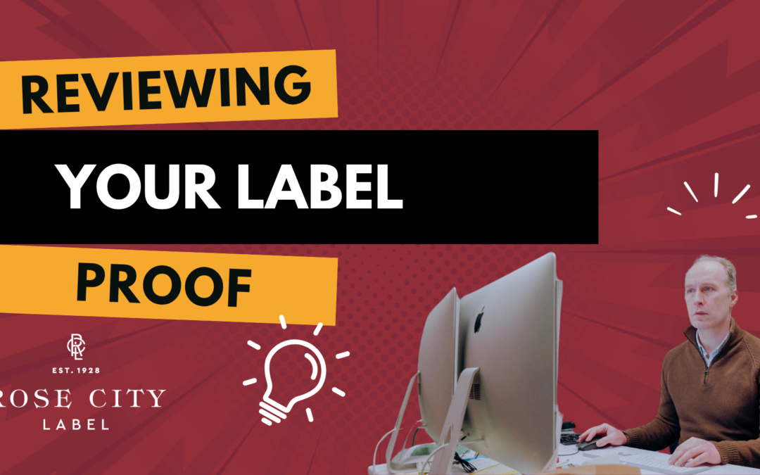
The short tutorial below walks through exactly what to do.
If you’d rather read than watch, here’s the quick version.
1. Print your proof at actual size
When we send you a proof, it’s a PDF set to the exact dimensions of your finished label. That matters because if the label is small enough to fit on standard paper, you can print it, cut it out, and physically place it on your bottle or jar to confirm it looks right and actually fits.
The catch: most PDF viewers default to shrinking the proof down to fit on letter-size paper. That defeats the entire point. A label that “looks good” at 87% will not look the same at 100%.
In your print dialog, look for a scaling setting. Depending on your PDF viewer, it might be labeled:
Actual size
100%
Do not scale
Scale to 100%
The exact wording varies. Adobe Acrobat and Adobe Acrobat Reader use “Actual size”; other viewers phrase it differently. But they all mean the same thing: print the file at the dimensions it was created at, with no resizing.
To make verification easy, every proof we send includes a small ruler marked at 3.5 inches. After you print, hold a real ruler up against ours. If the two match, you’ve printed at actual size. If they don’t, your printer scaled the file down. Adjust your print settings and try again.
2. Turn on Overprint Preview
This one is more technical, but it’s the difference between catching a problem on a proof and discovering it on a finished press run.
Overprint Preview is your PDF viewer’s way of showing you how a document will actually look when printed on a professional press, rather than how it appears on a screen or from an inkjet printer. When it’s off, you’re seeing a screen-friendly approximation. When it’s on, you’re seeing a much closer simulation of what the press will actually produce, including how overlapping inks will interact.
Here’s the problem: in Adobe Acrobat and Adobe Reader, Overprint Preview is off by default for most files. You have to turn it on yourself.
How to enable it in Adobe Acrobat or Adobe Reader
Open the Preferences menu (called Settings in some versions). Go to the Page Display pane. You’ll see an option for Use Overprint Preview, which by default is set to “Only for PDF/X files” — meaning it’s effectively off for the proofs you’re looking at. Change it to Always.
Why it matters: a real example
In the tutorial video above, you’ll see a proof for a wine label with the vintage “Syrah 2023” set in a very light yellow over a mustard-colored background. With Overprint Preview off, the year reads just fine. The proof looks correct, and you’d be tempted to sign off on it.
Turn Overprint Preview on, and the year disappears entirely.
What’s happening: the light yellow text was set to “overprint” the background. A screen or an inkjet printer mostly ignores that setting, so the text shows up. But a professional press honors that setting literally, and a very light color overprinting a darker color will be invisible. If you approved that proof without Overprint Preview enabled, you’d never know the vintage year was going to vanish until your labels arrived.
This is exactly the kind of issue our pre-press team works to catch and flag back to you before sign-off. But Overprint Preview gives you a second set of eyes on it, and lets you spot anything that should be discussed before the file goes to press.
A quick checklist for proof review
Before you sign off on any proof, run through this:
Printed at actual size (verified against the 3.5″ ruler on the proof).
Cut out and hold against the actual product or container where applicable.
Viewed on screen with Overprint Preview turned on.
All copy reads correctly — vintage years, ABV, net weight, ingredient lists, addresses, allergen statements.
Colors and finishes match expectations.
Any questions or flags we sent over have been addressed.
When something looks off, tell us.
If anything in your proof looks wrong, or if you turn on Overprint Preview and something disappears or shifts in a way you weren’t expecting, flag it back to us before you approve. That’s exactly what the proofing round is for, and we’d rather make the fix now than discover it after the press is running.
If you’re not sure how to enable Overprint Preview in your specific PDF viewer, or you want a second opinion on what you’re seeing, just reply to your proof email. We’re happy to walk through it with you.
At Rose City Label, we take pride in helping designers and brand owners create stunning, press-ready artwork. If you’re unsure how to prepare a file, our prepress team is here to help.
At Rose City Label, color consistency is one of the most challenging aspects we strive to achieve, and one of the most crucial. If your brand relies on a specific color to stand out on the shelf, you already know how much it matters.
This month, we’re adding HP Indigo’s closed-loop color measurement and control system (Spot Master) to our digital press. This technology enables continuous measurement of printed color during a run and allows the press to make real-time adjustments to keep colors within tolerance. It’s a meaningful step forward for our production team and a powerful tool for our customers with high-precision color requirements.
What is HP Indigo Spot Master? HP Indigo Spot Master is a sophisticated color control system built into the digital press. By using real-time data, the system can monitor brand-critical colors and help maintain stability from start to finish. This technology moves us beyond simple visual matching, adding a new layer of data-driven confidence to the printing process.
Why Spot Colors Are Challenging on Digital Presses
On a traditional flexo press, matching a brand color involves mixing a specific ink. Digital printing is different; it builds colors using the CMYK process. While digital can reproduce almost any color, maintaining absolute consistency on certain “tricky” hues from the first label to the last has traditionally required intense manual monitoring.
Until now, achieving a great digital match required careful setup and experienced operators. While we have always delivered great results, this upgrade gives us a more automated way to manage those high-stakes brand colors.
What This Upgrade Changes
The new system introduces closed-loop color control. For projects that require it, the press can now be set to measure color as it prints. If the color begins to shift, the system can assist the operator in bringing it back into tolerance.
Instead of just setting the color at the start of the run, we now have the ability to actively manage it throughout the process. For specific high-precision projects, we can even generate a documented report that tracks color performance from start to finish.
Is This Right for Your Next Project?
While our standard process already delivers the high quality our customers have relied on for years, this new technology is a game-changer for brands with “zero-tolerance” color requirements.
This might be the right fit for you if:
You have a signature brand color that must be identical across every SKU.
You are running a large digital order where color stability is paramount.
Your project requires documented verification of color consistency.
Because this level of measurement adds a layer of complexity to the production process, we evaluate its use on a case-by-case basis to ensure we are maintaining the best balance of speed and precision for your project.
Why This Sets Rose City Label Apart
This is an investment in quality and consistency. While many digital printers rely solely on visual checks, we are adding data-driven correction and documentation to our toolkit.
If you have a project with a demanding color profile, let’s talk. We can help you determine if this new technology is the right fit for your labels to ensure your brand looks its best every time it hits the shelf.
In flexographic printing, we love creative label designs that layer images and color, but things get tricky when transparent images are placed over backgrounds. Transparent images won’t trap to other elements in your design.
If you’re a designer, you don’t need to worry about trapping files yourself, but setting up your artwork correctly can make the process smoother and ensure your final label prints beautifully.
Here’s why transparent images can cause problems and how to fix them before your file reaches prepress.
Why Transparent Images Are a Problem
Trapping is the process of overlapping colors slightly so there are no white gaps if the stock shifts during printing.
When an image has a transparent background, our trapping software doesn’t have a defined color to work with. The program doesn’t know exactly where one color ends and the next begins.
So, even if your design looks perfect on screen, the software can’t calculate how to trap those edges. The result? Fine white lines, small gaps, or color mismatches around your image.
How to Fix It: Convert the Image for Trapping
To make a transparent image work in flexo printing, we must convert it to a solid image with a clipping mask and a filled background.
Here’s how that process works:
Step 1: Create a Clipping Mask in Photoshop
Open your image in Photoshop.
Create a new Alpha Channel and select the area you want to keep.
Delete that area from your alpha channel.
Invert the selection (Command/Ctrl + I) to define the background area.
Copy that mask (Command/Ctrl + A, then Copy).
Step 2: Paste into Illustrator and Trace
Paste the shape into Illustrator and size it to match your image.
Use Image Trace (set to Silhouette) to create a clean outline.
Expand the traced object, bring it to the front, and make it a Compound Path (Command/Ctrl + 8).
Select the image and path, then make a Clipping Mask (Command/Ctrl + 7).
Now you have a clean shape, but it’s still transparent.
Step 3: Add a Solid Background for Trapping
Go back to Photoshop and reselect the area around your image.
Contract the selection slightly (about 2 pixels depending on the resolution of your image).
Invert your selection to select the transparent area.
Use Content-Aware Fill to fill in that space.
This creates a subtle, color-matched fill behind your image.
Save and relink the updated file in Illustrator.
You’ll now have a filled image that looks the same visually, but under the hood, it has a solid background that the trapping program can recognize.
Why It Works
Adding this subtle fill gives the prepress software the correct information to overlap colors during trapping. The result is:
Clean edges
No white gaps
Smooth transitions between image and background color
Even though you can’t see the difference in your design file, this adjustment makes all the difference when your label runs on press.
The Takeaway
If you’re designing for flexographic printing, avoid sending files that rely on transparent backgrounds. Instead, use clipping masks and solid fills to ensure your artwork traps correctly.
These small steps help ensure your labels print beautifully without visible edges or color separation.
Watch the video below for a full demonstration of this process, including creating the clipping mask, filling the background, and setting up your file for trapping.
At Rose City Label, we take pride in helping designers and brand owners create stunning, press-ready artwork. If you’re unsure how to prepare a file, our prepress team is here to help.
You’ve done it. You’ve perfected your grandma’s secret sauce, found the perfect sustainable packaging, and are ready to share your creation with the world. The last step is the label—the beautiful, eye-catching design that will make customers grab your product off the shelf.
As your label printing partner, we understand that a beautiful design is only half the battle in a regulated industry like food and beverage. An incorrect label can lead to costly recalls or fines. While you have the final responsibility for designing and approving a compliant label, we believe in being an informed partner. We stay familiar with current regulations because the more we understand your world, the better we can serve you as your printer.
The FDA’s Must-Haves
Based on recent FDA guidance, every food label has a few non-negotiable elements. Ensuring these are correct on your final design is a critical step before you send your files to print.
Statement of Identity: The common or usual name of the food.
Net Quantity of Contents: How much product is inside, listed in both U.S. and metric units.
Name and Place of Business: The name of the manufacturer, packer, or distributor.
Ingredient Declaration: A list of ingredients in descending order by weight.
Nutrition Facts Panel: Required unless the product qualifies for a specific exemption.
Allergen Declaration: An explicit declaration of the nine major food allergens, such as milk, wheat, peanuts, and sesame.
Common (and Costly) Mistakes to Avoid
The FDA emphasizes a few key areas during inspections. A simple mistake in one of these areas can cause significant headaches for a food company. Keep an eye out for these common violations:
Undeclared Major Allergens
Misuse of “Gluten-Free” Claims: If you make this claim, the product must be tested and verified to contain no more than 20 ppm of gluten.
Incorrect or Missing Nutrition Facts
False or Unauthorized Health/Nutrient Claims
Navigating these rules can feel overwhelming. That’s why it’s so important to work with a dedicated legal or regulatory expert to get your label right before it comes to us for printing. As your printing partner, we have deep experience in the food industry, which means we understand your complexities. We’re committed to printing your final, approved design with the quality and precision your brand deserves.
Disclaimer: The information in this blog post is for informational purposes only and does not constitute legal advice. We are label printing experts, not lawyers. Please consult your legal counsel to ensure your labels fully comply with all applicable laws and regulations.
If you’ve ever sent artwork to print, you’ve probably heard the term bleed.
It’s one of those critical prepress details that ensures your labels look clean and professional once they’re cut to size. But what exactly is bleed, and how do you properly set it up?
Let’s examine what bleed means, why it matters, and a few practical ways to incorporate it into your artwork.
Why Bleed Matters
Bleed is the area that extends beyond your label’s final cut line (die line).
There is always a small amount of movement as labels move through the press and cutting die. Without bleed, this can lead to thin white edges or bare stock showing where your design ends too close to the cut.
The rule of thumb:
Any artwork within 1/16 of an inch of the die line should continue at least 1/16 inch beyond it.
That extra buffer ensures a clean finish, even if the die shifts slightly during cutting.
Simple Bleed Example
For simple designs, bleed is straightforward. Imagine a solid gray background that runs to the edge of your label:
Just extend the shape 1/16 inch past the die line.
In Illustrator, you can use Offset Path to build that extra margin quickly.
That’s it, bleed done!
Trickier Bleed Scenarios
Sometimes bleed isn’t so simple. Here are three common cases and how to solve them:
1. Raster Images (Photoshop Files)
If your artwork ends right at the die line and you need more image beyond it:
Open the file in Photoshop.
Expand your canvas by 1/8 inch.
Use Content-Aware Fill to extend the artwork into the new space.
Save and re-import the updated image into your label design.
It may not be perfect, but it usually blends seamlessly once printed and cut.
2. Vector Artwork
Vector files are trickier. The best option is to make the art bigger.
But if the artwork must stop at the die line, you’ll need to extend elements manually:
Select and stretch vector shapes carefully.
Or redraw parts of the design to push them past the edge.
This can be tedious, but it’s the only way to ensure proper bleed when resizing isn’t an option.
3. Mixed Artwork
For labels that combine vector graphics and raster images, you may need to use both methods: content-aware fill for images, and manual adjustments for vector shapes.
The Bottom Line
Bleed may feel like extra work, but it’s one of the most critical steps in preparing artwork for print. It prevents bare edges, ensures consistent results, and gives your labels a professional finish.
Taking the time to add bleed upfront saves you (and your printer) headaches later.
Watch the video below for a complete walkthrough, including examples of extending bleed in Photoshop and Illustrator.
At Rose City Label, we’re here to ensure that your artwork is print-ready so that your labels look as good in real life as they do on screen. Contact us for a quote.