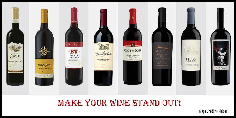
Customer behavior testing can help us design better wine labels. Really.
Wine label design is very personal – every wine brand has a unique story to tell. Often, this has meant that everyone was designing by the ‘seat of their pants’ with no science behind the decisions and no validation of what works. Now, thanks to a December 2015 report by Nielsen, we have actual customer data to give us insight into what catches the eye (*and perhaps, why). This great research paper has comments and insights from individuals, but also scientific data that shows where the human eye goes on the shelf, and how long it stays there. This behavior can change over time, so this study will be repeated in the future, but for now, this data is a golden opportunity to put some science behind the highly emotional process of wine label design.
Click here to download the 15 page PDF for the entire report.
As we have written before in this post, your labels must be authentic and reflect your true brand values, culture, and be consistent with other parts of your messaging. Don’t just make a massive switch to your label design based on this report – it won’t work.
Instead, take these insights and incorporate them into the overall conversation about your positioning and branding in the market.
Here are the key points:
- In addition to gabbing consumers’ attention, the label must also convey certain key messages, points of differentiation from competition, and a distinct personality.
- 64% of consumers will try a product because the package catches their eye. 41% will continue to buy a product because they like the packaging.
- The wine category is crowded. 4,200 new wines were introduced in 2014.
- Consumers make most decisions at the retail shelf – the category is fragmented with little brand loyalty.
- Media spending is low relative to other commodities, so shelf appeal is even more important.
- Package design can also help gain distribution – labels appeal to restaurant owners and wholesale distributors too.
Additional key findings:
- To stand out, be colorful and contrarian. The most visible bottles are seen by up to 77% more consumers than less visible ones, according to eye tracking measures.
- Distinct personalities drive engagement. Lower price points tend to succeed with casual, fun themes. Higher price points have more uniform design.
- Millennials favor bold and breezy. This is particularly true on the lower price points, but also on higher tiers. Younger buyers value tradition less.
- There are unclaimed areas in the market. Despite saturation of product, there are open areas to fill. See page 8 of the report for full details.
- Images attract attention, but not always positive. Be careful if your central graphic is controversial – the attention may backfire with some consumers.
- Colors, shape, typeface, and images make the label. These are the key elements that define a label – use them to your advantage.
The wonderful news for winery brand owners of all sizes is that all these design elements are available to almost everyone now.
The power of digital printing technology has leveled the playing field and allowed brands of all sizes to have a fair shot at gaining the consumers’ attention and winning at the retail shelf. Thank you for trusting Rose City Label with your project.

